
A Ducati Monster 821, with our cluster concept — showing navigation
The last two years has seen a sea change in motorcycle instrument clusters. The interface has moved from traditional dials and LCD displays to TFT screens as seen in cars. This has allowed bike makers and designers to utilise every pixel, colour range and motion possibility to the maximum — and going by current trends they are.
But with the freedom to display anything on this relatively small high definition screen, comes the issue of displaying too much information. This thought piece speaks about this issue of excess and brings the focus back to the needs of the rider and an understanding of context — in defining the best possible user experience for a motorcycle’s interface.
A rider sometimes has to take their eyes off the road for a split second, to check if they are within the speed limit or perhaps to see that splash of colour change due to the rev change. That time could be the difference between another road user not checking their blind spot and causing the rider to come off. A simple principle that we should follow would be:
What does the rider WANT to see vs What does the rider NEED to see
Both can be important — they need to be given their due diligence and treated differently in design. This simple difference in logic can help designers and technologists make the decision on which form the information can take on a display, while also thinking about all the advantages of connected technologies within the motorcycle (GPS, bluetooth etc). This leads to our point of view with a few examples to illustrate.
Key element 1: Clean and adaptive insights — reduced clutter

Adaptive hierarchy and motion combined
We have used the principle of ‘adaptive hierarchy’ to fundamentally relook at all the tell tales and the information presented on screen. The motorcycles ignition kicks off the startup for the interface and also a systems check which then flows into a clean uncluttered interface. The tell tales such as engine health lights remain lit if there is an issue or fades away to the fuel range and gear indicator if everything is okay.
Our goal was to keep the most important highlights at the forefront, for the everyday rider. But that does not mean they will not be able to see details — which will be just under one layer of interaction.
Key element 2: Contextual and connected information
Our first step in working on the cluster was to think deeply about connectivity and all the contextual information that can be offered to a rider.

It goes against traditional methods of design where ‘all’ information is laid out on screen, instead we are asking the question — ‘when is the information important to be seen?’ This can be both automated based on machine learning meted out to the machine or customisable by the rider manually themselves.
Both approaches are appropriate when used correctly and here are a few examples when we can use automated decision making to keep the rider informed and safe when something is wrong — only on a need to know basis keeping safety first and foremost in mind.

Adverse weather, High Beams on, Lane change
Key element 3: Glanceable and gradual escalation of feedback
Similarly to our original in-car cluster piece, glanceability is of huge importance. Maybe even more so for motorcycle riders. Although the key aspects are practically the same, on a motorcycle importance given to elements are very different. A riders vision can be obscured by; their own helmet forcing a more exaggerated look around, rainwater on the screen itself or rain on the visor, glare from the sun, engine vibrations as well as other factors. Taking all of these into account, the time in which it takes to glance down at the display can be severely reduced. We would only have a small window to display relevant information as clear as possible. That in itself is a huge design challenge.
We tackle this issue through different mechanisms…
A. Typeface — Humanist: One may wonder about the efficacy of just changing type on an automotive interface, but a humanist typeface has been proven to have quicker glance times in automotive interfaces — as shown in this wonderful MIT Agelab study.
A 10% decrease in glance times can be valuable in a life and death scenario and hence helped us make the decision to use this family of typefaces in our concept. This has been the primary motivation with our focus on lowercase throughout the interface, helping save those precious milliseconds on glances towards the cluster.
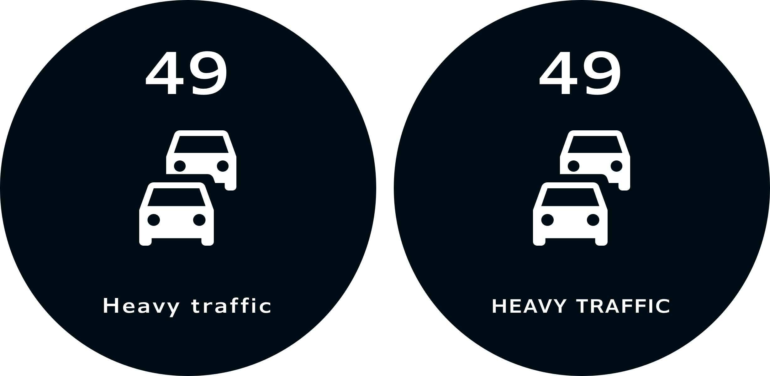
Comparison between lowercase and uppercase. Observe the legibility of the lowercase ‘Heavy Traffic’ information on the left.
B. Motion and the gradual escalation of feedback: Our goal in this concept was to use motion appropriately — only when safe or attention needs to be grabbed without being excessive. We also wanted to keep animations and transitions consistent to create a sense of familiarity, brand and to build trust in the interface over time.
In order to best talk about this we have created the concept of ‘gradual escalation of feedback’. Feedback refers to the visual elements of the interface appearing on screen as the user applies an input such as turn signals, or when the contextuality of the situation prompts some indication on screen for example — ice on the road or strong winds ahead.

Use of motion for providing contextual information during increased speed
For this demo’s sake let’s take breaching the speed limit as an example. As a motorcyclist it is dangerous to actively keep one eye on the speedometer given the need for observing surroundings is much greater, especially in cities where strict speed limits are observed like London or New York. What matters more is to modulate speed in relation to surrounding traffic — and you sometimes need to exceed the speed limit in order to do so, to overtake or evade. But at the same time it does not pay to go way beyond the speed limit which may be both dangerous to the rider as well as other road users.
As you can see in the above gif, as the speed limit is exceeded the interface provides complimentary feedback via a smooth easing animation between the current speed and the pop-up for the roads speed limit. This pop-up eases in to provide a subtle nudge about the breach — keeping in mind the behaviour of speed modulation in traffic and an affordance of 10–15% miles per hour above the limit.
When the rider further increases speed — we see an escalation of feedback via the red rings in the periphery of the interface which appear far less subtly and is used to grab peripheral attention while informing the rider about potential dangerous driving.
So, a smooth transition (what we call “Bouba”) for non critical feedback and an abrupt transition (what we call “Kiki”) for critical feedback. We believe this escalation and treatment of motion can help prevent needless distraction while keeping the rider safe.
Key element 4: Aesthetics — retro revival and customisation

Our interface applied to the BMW brand
With the retro revival in full swing, motorcycle manufacturers have been busy launching motorcycles with the latest tech partnered with vintage styling. The custom motorcycle scene is booming, with riders meticulously scrutinising over every nut and bolt they put onto their creations, but one of the few things they have little control over is the screen/HMI.
This is the inspiration for the cleaner and more stylish look and feel for the cluster, which also allows for plenty of customisation. This could be a platform for users and designers to build on rather than sticking to a prescribed view.
Much like BMW Mottorad’s efforts to make the R-Nine-T as customisable as possible, through the use of colour, material and tonal variants. We could then pick and adapt key elements into our interface continuing the style and feel of the motorcycle into the display. It is a massive brand opportunity.
Exploring the R NineT brand with the same interface language, using material textures.
Key element 5: What about the brand?
Biking is about passion and functionality combined — which also extends deeply into branding too. Ducati owners will speak passionately about the styling, handling and sheer Italianess of their bikes, while BMW owners will speak about the efficiency, functionality and tremendous German build quality.
We truly believe that not branding an interface would be a lost opportunity for some of these brands to speak to their riders. As you can see from the previous BMW designs, how easily a flat two dimensional screen can become integrated into the style of the bike.
There are many restrictions around the use of colour which can hinder a brands reach within the clusters design. And typography or a custom typeface, although simple to apply to a digital interface, can cause issues with legibility and glanceability as we have mentioned previously. Not all brands use humanist fonts either so the branding would have to be applied with all these factors taken into account.

Comparison between existing Ducati cluster and our vision of a future cluster.
Keeping to the original principles from our previous in-car cluster piece, we have created a few interfaces that balance brand and styling with contextual information and usability, whilst using each brands respective typeface to find a middle ground.

Harley Davidson interfaces

BMW R nineT interfaces